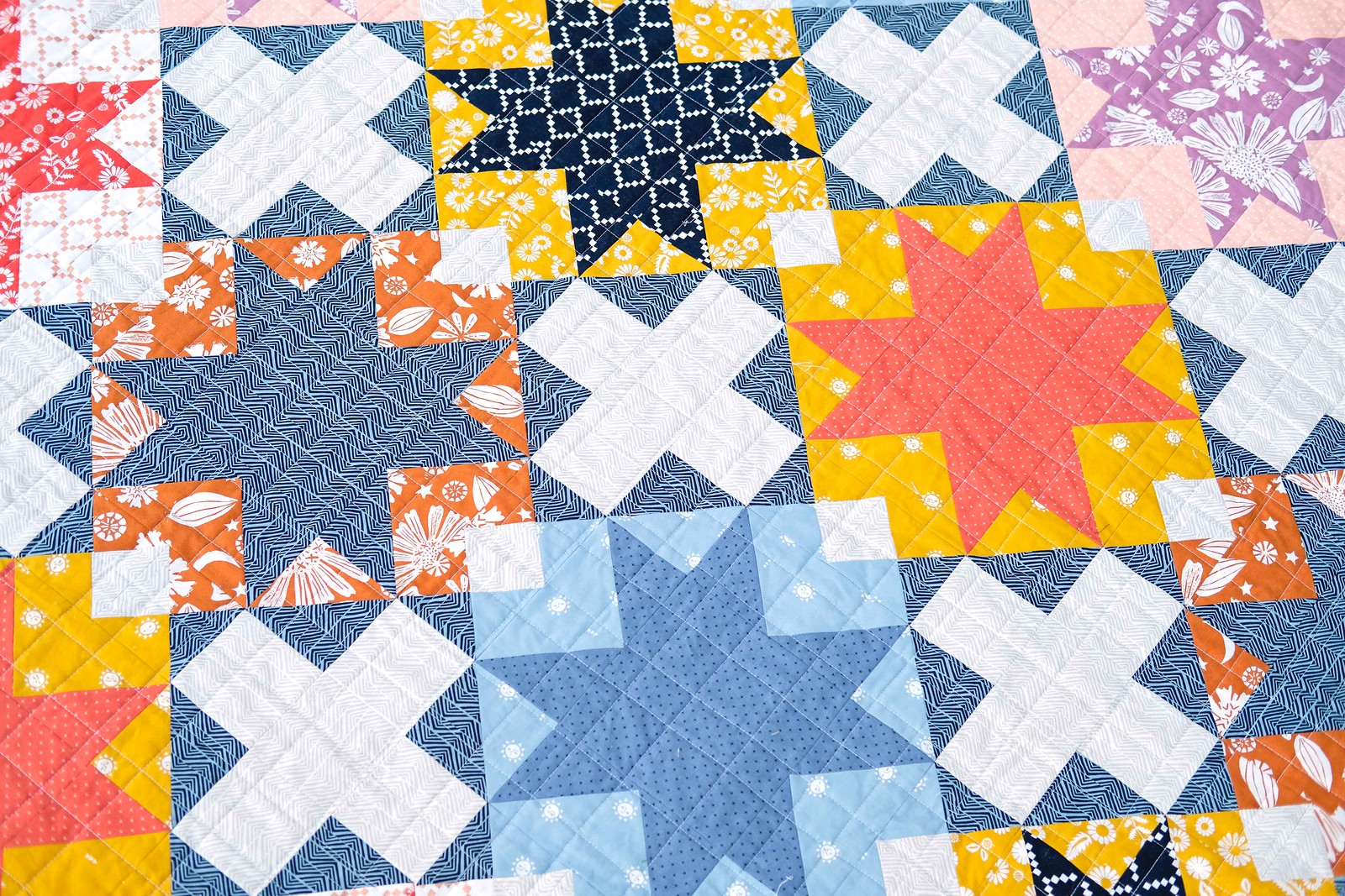
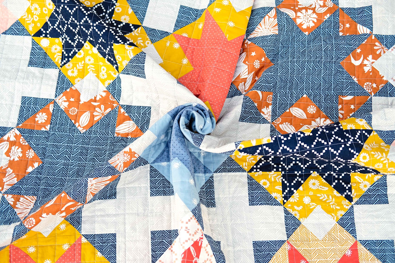
Thank you for being excited about the Maggie Quilt Pattern! I thought it would be helpful to share a little more about the version of the quilt on the cover and walk you through why this collection worked well here, to help you make decisions about your quilt.
I have been a big fan of Alexia Abegg's work ever since her Marcelle Medallion pattern (remember when everyone was making it?) so now when I get a chance to work with her fabrics, I am so excited! The Golden Hour collection is - no surprise - really beautiful and would work great in a variety of quilt patterns.

I wanted to use it in a pattern that would highlight my favorite print in the collection (the Mountain print, it is the neutral background fabric and the navy print used for the radiating star points). I am always on the lookout for prints that will work well mixed with other collection and that print fits the bill.

I also really like that variety of colors and values in the collection. The pink and purple are a little surprising, but also really fun! Because I wanted to make sure that I had a variety of fabric combinations, I mixed in a couple of Add it Up basic prints. This helped me make sure that two like-blocks weren't next to each other and helped give the quilt a little more variety with color/shade/value.

Generally when you are making a quilt, you want your quilt to have "movement." This means that instead of having your eyes to a single point on the quilt, your eyes will want to look around. One thing that I try to do to achieve this, is to make sure the darkest valued fabrics are distributed throughout the quilt. If you aren't sure about the value of your fabrics, taking a black and white photo of your quilt top can make it much easier to see.

Another thing to consider when making the pattern (or any pattern where two fabrics are going to be right next to each other) is to pair fabrics that have different scales. This means that if two fabrics are adjacent, I am generally using a larger scale print with a smaller scale print. Of course you can break this rule and sometimes that works really well, but it's a good general rule.

For the backing fabric, I used this really lovely orange floral print that just made me happy. The binding print is, not coincidentally, the darkest print from the collection - I like to use the binding to "frame" the quilt so I usually use a darker valued print. This is a personal preference - you can finish off your quilt however you like.
If you would like to make your own version of the
Maggie Quilt Pattern, head over to the shop to pick one up!


